#research design architectural architecture
Explore tagged Tumblr posts
Text
Wanted to add a couple of things from my own experience as a Methodist who grew up Baptist on the fringes of the Bible Belt.
I've been in Protestant Churches Built From Circa 1970-2005 long enough to know that it's not an either-or between (Carpenter) Gothic Chapel and Megachurch Monstrosity. There's a lot of bizarre flavors going on for the following reasons.
In the 1970s-1980s, there was a trend of building churches with gymnasiums that could function as a fellowship hall. As an example, the church I attend now was built in the late 1970s and we have a gym that was clearly built with this in mind (There's a kitchen attached, there's an AV booth, etc.). In some cases, these gyms were built before the actual sanctuary, due to their multipurpose nature and capacity.
At least by the 2000s, this evolved into more multi-purpose sanctuaries in general, stuff that could double as a fellowship hall if need be. The church I grew up in didn't have a gym, but the sanctuary's seating was removable and the room could be divided into sections for smaller events if need be. (It was still recognizably a church, though. There was a choir loft and a baptistry and a giant wooden cross hanging on the back wall, and whatnot.
Once the sanctuary was built, the church building might be expanded on to meet the practical needs of the congregation. Most often you see additions for classroom space, for the sake of Bible studies, Sunday school classes, or Christian schools that might use the building.
These expansions might be made as the congregation is able to raise money for them, so things tend to be simpler in design, and there may not be a lot of clear rhyme or reason as to how things get placed, beyond There Was Room Here. (As you said, op, resources are a big factor here.)
As a result, there's a longstanding reality of reasonably-sized, theologically-orthodox Protestant churches with sprawling, eldritch architecture that defies reason because the building wasn't built all at once, and because the focus was upon how the building might also be used by the congregation outside of a Sunday morning.
None of that's to say I think church architecture shouldn't mean something. But for a certain genre of Hideous Protestant Church architecture, the value being communicated is serving others, or the need for church community in the Christian life, rather than strictly The Church Is A Product To Be Sold.
With that said, I feel like it's worth mentioning that by and large, these churches still have architectural features that say, This is a church, like steeples, crosses, windows, whatever. While they're weird-looking buildings, they're not afraid to signal to passersby what the primary intention for the building is.
Furthermore, the market research thing is very real. One of the points where the church I grew up in began to go downhill was when the new head pastor hired a marketing firm to "fix" the church and to give it more mass appeal... which inevitably involved getting rid of any architectural features that suggested this was a church. Looking at pictures of the inside of it now, it's basically unrecognizable as a place of worship. It looks more like a concert venue than anything else. And I think that, regardless of where you fall on how ornate a church should be, is cause for concern.
Setting aside issues like the practical needs for space, or the finances to afford constructing/renovating a building in the first place, why is there such apprehension about church buildings that suggest who we worship and why we gather? What does that say about how we might feel about Jesus?
Roman Catholics and Orthodox have got to knock it off with "Protestants have brutalist corporate churches". A particular modern strain of Protestantism has hideous modern churches. It's a depressingly common strain, and arguably the dominant one in America, but it's either ignorant or dishonest to pretend as though all Protestants have ugly churches.
Behold:
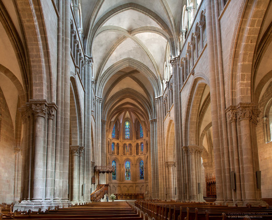
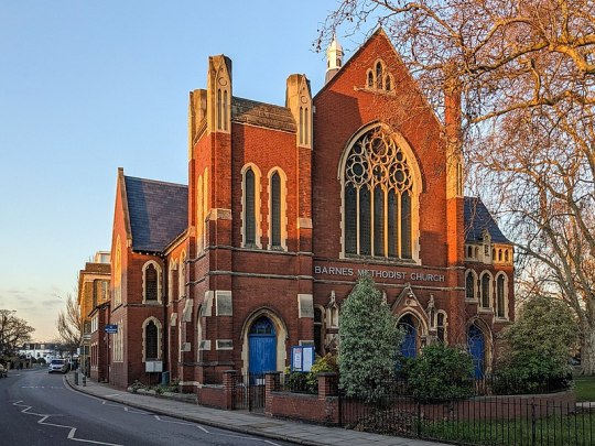
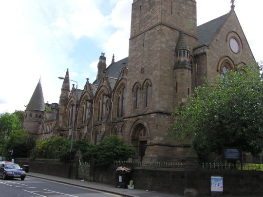
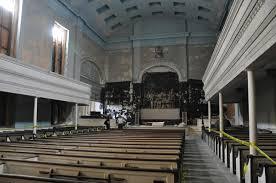
Clockwise from top left:
St. Peter's Church, Geneva, canton of Geneva, Switzerland (Swiss Reformed)
Barnes Methodist Church, London, England, UK (Methodist)
Dutch Reformed Church, Newbury, New York state, USA (Dutch Reformed)
St. Jude's Church, Glasgow, Scotland, UK (Presbyterian)
#not trying to derail anything that's been said whatsoever; i hope it doesn't come across that way#tbh my experience of reading this post was:#'[sees that op recognizes the nuances of protestant church architecture] finally some good freakin' food'#i could go on about my experiences with bizarre protestant church architecture all day but this ain't about that#but i would love to ramble about it if asked#christianity tag#general protestantism tag#sacramental theology#(kinda sorta)#religious art tag
147 notes
·
View notes
Text
Fantasy Guide to Interiors
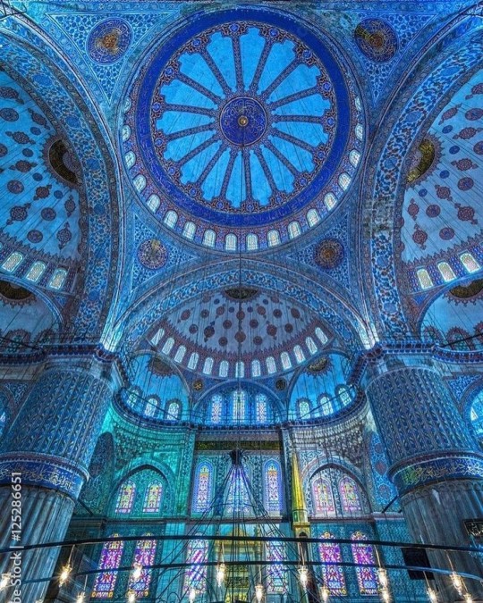
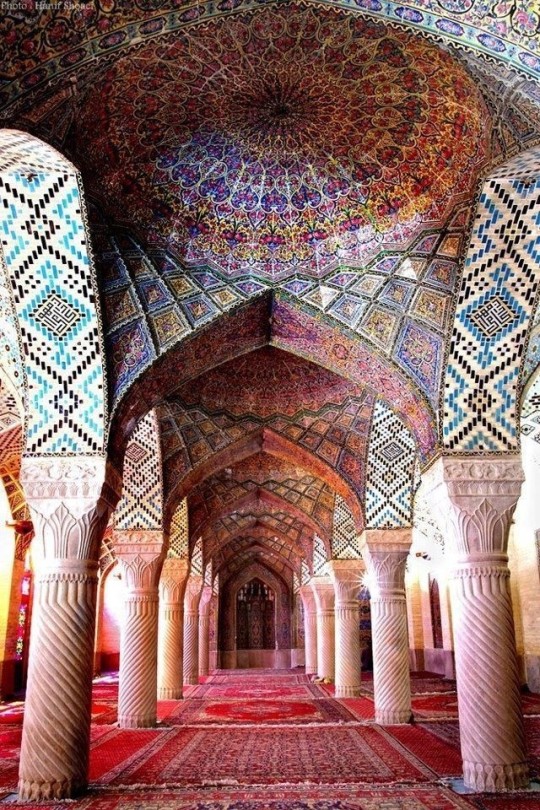
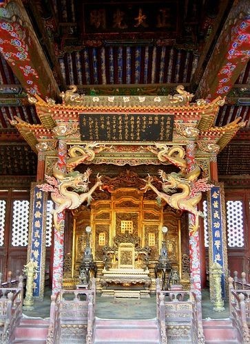
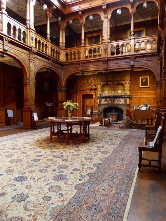
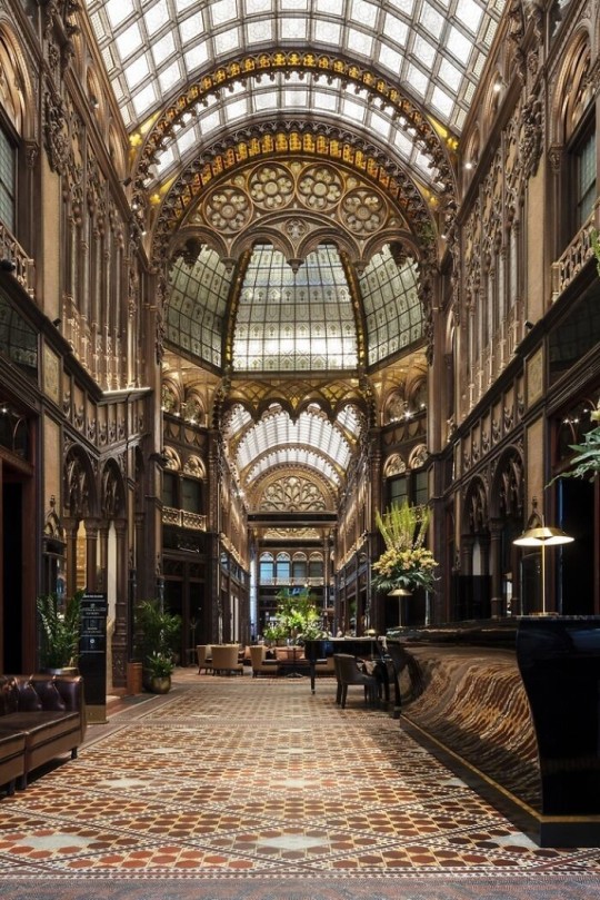
As a followup to the very popular post on architecture, I decided to add onto it by exploring the interior of each movement and the different design techniques and tastes of each era. This post at be helpful for historical fiction, fantasy or just a long read when you're bored.
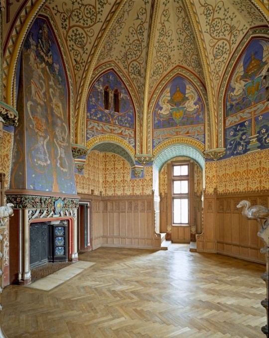
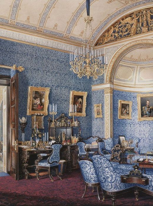
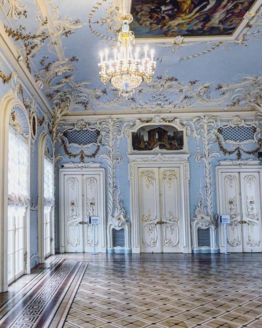
Interior Design Terms
Reeding and fluting: Fluting is a technique that consists a continuous pattern of concave grooves in a flat surface across a surface. Reeding is it's opposite.
Embossing: stamping, carving or moulding a symbol to make it stand out on a surface.
Paneling: Panels of carved wood or fabric a fixed to a wall in a continuous pattern.
Gilding: the use of gold to highlight features.
Glazed Tile: Ceramic or porcelain tiles coated with liquid coloured glass or enamel.
Column: A column is a pillar of stone or wood built to support a ceiling. We will see more of columns later on.
Bay Window: The Bay Window is a window projecting outward from a building.
Frescos: A design element of painting images upon wet plaster.
Mosaic: Mosaics are a design element that involves using pieces of coloured glass and fitted them together upon the floor or wall to form images.
Mouldings: ornate strips of carved wood along the top of a wall.
Wainscoting: paneling along the lower portion of a wall.
Chinoiserie: A European take on East Asian art. Usually seen in wallpaper.
Clerestory: A series of eye-level windows.
Sconces: A light fixture supported on a wall.
Niche: A sunken area within a wall.
Monochromatic: Focusing on a single colour within a scheme.
Ceiling rose: A moulding fashioned on the ceiling in the shape of a rose usually supporting a light fixture.
Baluster: the vertical bars of a railing.
Façade: front portion of a building
Lintel: Top of a door or window.
Portico: a covered structure over a door supported by columns
Eaves: the part of the roof overhanging from the building
Skirting: border around lower length of a wall
Ancient Greece
Houses were made of either sun-dried clay bricks or stone which were painted when they dried. Ground floors were decorated with coloured stones and tiles called Mosaics. Upper level floors were made from wood. Homes were furnished with tapestries and furniture, and in grand homes statues and grand altars would be found. Furniture was very skillfully crafted in Ancient Greece, much attention was paid to the carving and decoration of such things. Of course, Ancient Greece is ancient so I won't be going through all the movements but I will talk a little about columns.
Doric: Doric is the oldest of the orders and some argue it is the simplest. The columns of this style are set close together, without bases and carved with concave curves called flutes. The capitals (the top of the column) are plain often built with a curve at the base called an echinus and are topped by a square at the apex called an abacus. The entablature is marked by frieze of vertical channels/triglyphs. In between the channels would be detail of carved marble. The Parthenon in Athens is your best example of Doric architecture.
Ionic: The Ionic style was used for smaller buildings and the interiors. The columns had twin volutes, scroll-like designs on its capital. Between these scrolls, there was a carved curve known as an egg and in this style the entablature is much narrower and the frieze is thick with carvings. The example of Ionic Architecture is the Temple to Athena Nike at the Athens Acropolis.
Corinthian: The Corinthian style has some similarities with the Ionic order, the bases, entablature and columns almost the same but the capital is more ornate its base, column, and entablature, but its capital is far more ornate, commonly carved with depictions of acanthus leaves. The style was more slender than the others on this list, used less for bearing weight but more for decoration. Corinthian style can be found along the top levels of the Colosseum in Rome.
Tuscan: The Tuscan order shares much with the Doric order, but the columns are un-fluted and smooth. The entablature is far simpler, formed without triglyphs or guttae. The columns are capped with round capitals.
Composite: This style is mixed. It features the volutes of the Ionic order and the capitals of the Corinthian order. The volutes are larger in these columns and often more ornate. The column's capital is rather plain. for the capital, with no consistent differences to that above or below the capital.
Ancient Rome
Rome is well known for its outward architectural styles. However the Romans did know how to add that rizz to the interior. Ceilings were either vaulted or made from exploded beams that could be painted. The Romans were big into design. Moasics were a common interior sight, the use of little pieces of coloured glass or stone to create a larger image. Frescoes were used to add colour to the home, depicting mythical figures and beasts and also different textures such as stonework or brick. The Romans loved their furniture. Dining tables were low and the Romans ate on couches. Weaving was a popular pastime so there would be tapestries and wall hangings in the house. Rich households could even afford to import fine rugs from across the Empire. Glass was also a feature in Roman interior but windows were usually not paned as large panes were hard to make. Doors were usually treated with panels that were carved or in lain with bronze.
Ancient Egypt
Egypt was one of the first great civilisations, known for its immense and grand structures. Wealthy Egyptians had grand homes. The walls were painted or plastered usually with bright colours and hues. The Egyptians are cool because they mapped out their buildings in such a way to adhere to astrological movements meaning on special days if the calendar the temple or monuments were in the right place always. The columns of Egyptian where thicker, more bulbous and often had capitals shaped like bundles of papyrus reeds. Woven mats and tapestries were popular decor. Motifs from the river such as palms, papyrus and reeds were popular symbols used.
Ancient Africa
African Architecture is a very mixed bag and more structurally different and impressive than Hollywood would have you believe. Far beyond the common depictions of primitive buildings, the African nations were among the giants of their time in architecture, no style quite the same as the last but just as breathtaking.
Rwandan Architecture: The Rwandans commonly built of hardened clay with thatched roofs of dried grass or reeds. Mats of woven reeds carpeted the floors of royal abodes. These residences folded about a large public area known as a karubanda and were often so large that they became almost like a maze, connecting different chambers/huts of all kinds of uses be they residential or for other purposes.
Ashanti Architecture: The Ashanti style can be found in present day Ghana. The style incorporates walls of plaster formed of mud and designed with bright paint and buildings with a courtyard at the heart, not unlike another examples on this post. The Ashanti also formed their buildings of the favourite method of wattle and daub.
Nubian Architecture: Nubia, in modern day Ethiopia, was home to the Nubians who were one of the world's most impressive architects at the beginning of the architecture world and probably would be more talked about if it weren't for the Egyptians building monuments only up the road. The Nubians were famous for building the speos, tall tower-like spires carved of stone. The Nubians used a variety of materials and skills to build, for example wattle and daub and mudbrick. The Kingdom of Kush, the people who took over the Nubian Empire was a fan of Egyptian works even if they didn't like them very much. The Kushites began building pyramid-like structures such at the sight of Gebel Barkal
Japanese Interiors
Japenese interior design rests upon 7 principles. Kanso (簡素)- Simplicity, Fukinsei (不均整)- Asymmetry, Shizen (自然)- Natural, Shibumi (渋味) – Simple beauty, Yugen (幽玄)- subtle grace, Datsuzoku (脱俗) – freedom from habitual behaviour, Seijaku (静寂)- tranquillity.
Common features of Japanese Interior Design:
Shoji walls: these are the screens you think of when you think of the traditional Japanese homes. They are made of wooden frames, rice paper and used to partition
Tatami: Tatami mats are used within Japanese households to blanket the floors. They were made of rice straw and rush straw, laid down to cushion the floor.
Genkan: The Genkan was a sunken space between the front door and the rest of the house. This area is meant to separate the home from the outside and is where shoes are discarded before entering.
Japanese furniture: often lowest, close to the ground. These include tables and chairs but often tanked are replaced by zabuton, large cushions. Furniture is usually carved of wood in a minimalist design.
Nature: As both the Shinto and Buddhist beliefs are great influences upon architecture, there is a strong presence of nature with the architecture. Wood is used for this reason and natural light is prevalent with in the home. The orientation is meant to reflect the best view of the world.
Islamic World Interior
The Islamic world has one of the most beautiful and impressive interior design styles across the world. Colour and detail are absolute staples in the movement. Windows are usually not paned with glass but covered in ornate lattices known as jali. The jali give ventilation, light and privacy to the home. Islamic Interiors are ornate and colourful, using coloured ceramic tiles. The upper parts of walls and ceilings are usually flat decorated with arabesques (foliate ornamentation), while the lower wall areas were usually tiled. Features such as honeycombed ceilings, horseshoe arches, stalactite-fringed arches and stalactite vaults (Muqarnas) are prevalent among many famous Islamic buildings such as the Alhambra and the Blue Mosque.
Byzantine (330/395–1453 A. D)
The Byzantine Empire or Eastern Roman Empire was where eat met west, leading to a melting pot of different interior designs based on early Christian styles and Persian influences. Mosaics are probably what you think of when you think of the Byzantine Empire. Ivory was also a popular feature in the Interiors, with carved ivory or the use of it in inlay. The use of gold as a decorative feature usually by way of repoussé (decorating metals by hammering in the design from the backside of the metal). Fabrics from Persia, heavily embroidered and intricately woven along with silks from afar a field as China, would also be used to upholster furniture or be used as wall hangings. The Byzantines favoured natural light, usually from the use of copolas.
Indian Interiors
India is of course, the font of all intricate designs. India's history is sectioned into many eras but we will focus on a few to give you an idea of prevalent techniques and tastes.
The Gupta Empire (320 – 650 CE): The Gupta era was a time of stone carving. As impressive as the outside of these buildings are, the Interiors are just as amazing. Gupta era buildings featured many details such as ogee (circular or horseshoe arch), gavaksha/chandrashala (the motif centred these arches), ashlar masonry (built of squared stone blocks) with ceilings of plain, flat slabs of stone.
Delhi Sultanate (1206–1526): Another period of beautifully carved stone. The Delhi sultanate had influence from the Islamic world, with heavy uses of mosaics, brackets, intricate mouldings, columns and and hypostyle halls.
Mughal Empire (1526–1857): Stonework was also important on the Mughal Empire. Intricately carved stonework was seen in the pillars, low relief panels depicting nature images and jalis (marble screens). Stonework was also decorated in a stye known as pietra dura/parchin kari with inscriptions and geometric designs using colored stones to create images. Tilework was also popular during this period. Moasic tiles were cut and fitted together to create larger patters while cuerda seca tiles were coloured tiles outlined with black.
Chinese Interiors
Common features of Chinese Interiors
Use of Colours: Colour in Chinese Interior is usually vibrant and bold. Red and Black are are traditional colours, meant to bring luck, happiness, power, knowledge and stability to the household.
Latticework: Lattices are a staple in Chinese interiors most often seen on shutters, screens, doors of cabinets snf even traditional beds.
Lacquer: Multiple coats of lacquer are applied to furniture or cabinets (now walls) and then carved. The skill is called Diaoqi (雕漆).
Decorative Screens: Screens are used to partition off part of a room. They are usually of carved wood, pained with very intricate murals.
Shrines: Spaces were reserved on the home to honour ancestors, usually consisting of an altar where offerings could be made.
Of course, Chinese Interiors are not all the same through the different eras. While some details and techniques were interchangeable through different dynasties, usually a dynasty had a notable style or deviation. These aren't all the dynasties of course but a few interesting examples.
Song Dynasty (960–1279): The Song Dynasty is known for its stonework. Sculpture was an important part of Song Dynasty interior. It was in this period than brick and stone work became the most used material. The Song Dynasty was also known for its very intricate attention to detail, paintings, and used tiles.
Ming Dynasty(1368–1644): Ceilings were adorned with cloisons usually featuring yellow reed work. The floors would be of flagstones usually of deep tones, mostly black. The Ming Dynasty favoured richly coloured silk hangings, tapestries and furnishings. Furniture was usually carved of darker woods, arrayed in a certain way to bring peace to the dwelling.
Han Dynasty (206 BC-220 AD): Interior walls were plastered and painted to show important figures and scenes. Lacquer, though it was discovered earlier, came into greater prominence with better skill in this era.
Tang Dynasty (618–907) : The colour palette is restrained, reserved. But the Tang dynasty is not without it's beauty. Earthenware reached it's peak in this era, many homes would display fine examples as well. The Tang dynasty is famous for its upturned eaves, the ceilings supported by timber columns mounted with metal or stone bases. Glazed tiles were popular in this era, either a fixed to the roof or decorating a screen wall.
Romanesque (6th -11th century/12th)
Romanesque Architecture is a span between the end of Roman Empire to the Gothic style. Taking inspiration from the Roman and Byzantine Empires, the Romanesque period incorporates many of the styles. The most common details are carved floral and foliage symbols with the stonework of the Romanesque buildings. Cable mouldings or twisted rope-like carvings would have framed doorways. As per the name, Romansque Interiors relied heavily on its love and admiration for Rome. The Romanesque style uses geometric shapes as statements using curves, circles snf arches. The colours would be clean and warm, focusing on minimal ornamentation.
Gothic Architecture (12th Century - 16th Century)
The Gothic style is what you think of when you think of old European cathedrals and probably one of the beautiful of the styles on this list and one of most recognisable. The Gothic style is a dramatic, opposing sight and one of the easiest to describe. Decoration in this era became more ornate, stonework began to sport carving and modelling in a way it did not before. The ceilings moved away from barreled vaults to quadripartite and sexpartite vaulting. Columns slimmed as other supportive structures were invented. Intricate stained glass windows began their popularity here. In Gothic structures, everything is very symmetrical and even.
Mediaeval (500 AD to 1500)
Interiors of mediaeval homes are not quite as drab as Hollywood likes to make out. Building materials may be hidden by plaster in rich homes, sometimes even painted. Floors were either dirt strewn with rushes or flagstones in larger homes. Stonework was popular, especially around fireplaces. Grand homes would be decorated with intricate woodwork, carved heraldic beasts and wall hangings of fine fabrics.
Renaissance (late 1300s-1600s)
The Renaissance was a period of great artistry and splendor. The revival of old styles injected symmetry and colour into the homes. Frescoes were back. Painted mouldings adorned the ceilings and walls. Furniture became more ornate, fixed with luxurious upholstery and fine carvings. Caryatids (pillars in the shape of women), grotesques, Roman and Greek images were used to spruce up the place. Floors began to become more intricate, with coloured stone and marble. Modelled stucco, sgraffiti arabesques (made by cutting lines through a layer of plaster or stucco to reveal an underlayer), and fine wall painting were used in brilliant combinations in the early part of the 16th century.
Tudor Interior (1485-1603)
The Tudor period is a starkly unique style within England and very recognisable. Windows were fixed with lattice work, usually casement. Stained glass was also in in this period, usually depicting figures and heraldic beasts. Rooms would be panelled with wood or plastered. Walls would be adorned with tapestries or embroidered hangings. Windows and furniture would be furnished with fine fabrics such as brocade. Floors would typically be of wood, sometimes strewn with rush matting mixed with fresh herbs and flowers to freshen the room.
Baroque (1600 to 1750)
The Baroque period was a time for splendor and for splashing the cash. The interior of a baroque room was usually intricate, usually of a light palette, featuring a very high ceiling heavy with detail. Furniture would choke the room, ornately carved and stitched with very high quality fabrics. The rooms would be full of art not limited to just paintings but also sculptures of marble or bronze, large intricate mirrors, moldings along the walls which may be heavily gilded, chandeliers and detailed paneling.
Victorian (1837-1901)
We think of the interiors of Victorian homes as dowdy and dark but that isn't true. The Victorians favoured tapestries, intricate rugs, decorated wallpaper, exquisitely furniture, and surprisingly, bright colour. Dyes were more widely available to people of all stations and the Victorians did not want for colour. Patterns and details were usually nature inspired, usually floral or vines. Walls could also be painted to mimic a building material such as wood or marble and most likely painted in rich tones. The Victorians were suckers for furniture, preferring them grandly carved with fine fabric usually embroidered or buttoned. And they did not believe in minimalism. If you could fit another piece of furniture in a room, it was going in there. Floors were almost eclusively wood laid with the previously mentioned rugs. But the Victorians did enjoy tiled floors but restricted them to entrances. The Victorians were quite in touch with their green thumbs so expect a lot of flowers and greenery inside. with various elaborately decorated patterned rugs. And remember, the Victorians loved to display as much wealth as they could. Every shelf, cabinet, case and ledge would be chocked full of ornaments and antiques.
Edwardian/The Gilded Age/Belle Epoque (1880s-1914)
This period (I've lumped them together for simplicity) began to move away from the deep tones and ornate patterns of the Victorian period. Colour became more neutral. Nature still had a place in design. Stained glass began to become popular, especially on lampshades and light fixtures. Embossing started to gain popularity and tile work began to expand from the entrance halls to other parts of the house. Furniture began to move away from dark wood, some families favouring breathable woods like wicker. The rooms would be less cluttered.
Art Deco (1920s-1930s)
The 1920s was a time of buzz and change. Gone were the refined tastes of the pre-war era and now the wow factor was in. Walls were smoother, buildings were sharper and more jagged, doorways and windows were decorated with reeding and fluting. Pastels were in, as was the heavy use of black and white, along with gold. Mirrors and glass were in, injecting light into rooms. Gold, silver, steel and chrome were used in furnishings and decor. Geometric shapes were a favourite design choice. Again, high quality and bold fabrics were used such as animal skins or colourful velvet. It was all a rejection of the Art Noveau movement, away from nature focusing on the man made.
Modernism (1930 - 1965)
Modernism came after the Art Deco movement. Fuss and feathers were out the door and now, practicality was in. Materials used are shown as they are, wood is not painted, metal is not coated. Bright colours were acceptable but neutral palettes were favoured. Interiors were open and favoured large windows. Furniture was practical, for use rather than the ornamentation, featuring plain details of any and geometric shapes. Away from Art Deco, everything is straight, linear and streamlined.
#This took forever#I'm very tired#But enjoy#I covered as much as I could find#Fantasy Guide to interiors#interior design#Architecture#writings#writing resources#Writing reference#Writing advice#Writer's research#writing research#Writer's rescources#Writing help#Mediaeval#Renaissance#Chinese Interiors#Japanese Interiors#Indian interiors#writing#writeblr#writing reference#writing advice#writer#spilled words#writers
3K notes
·
View notes
Text
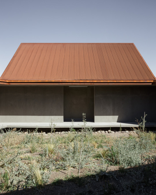
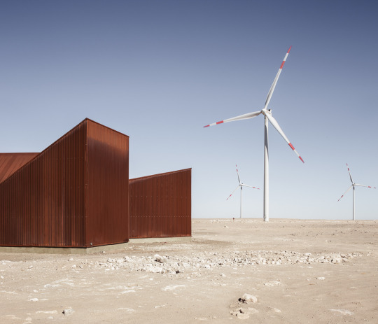
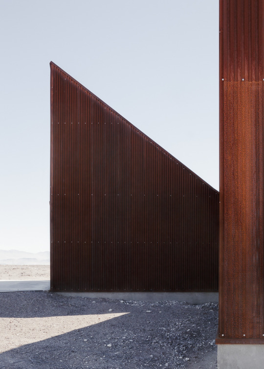


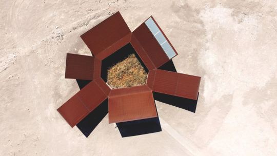

Desert Interpretation Centre, Antofagasta, Chile - Emilio Marín & Juan Carlos López
#Emilio Marín & Juan Carlos López#architecture#design#building#modern architecture#interiors#minimal#concrete#metal cladding#corrugated#rust#desert#landscape#research centre#plywood#wind turbines#chile#south america#cool architecture
181 notes
·
View notes
Text

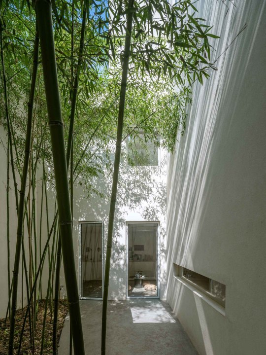
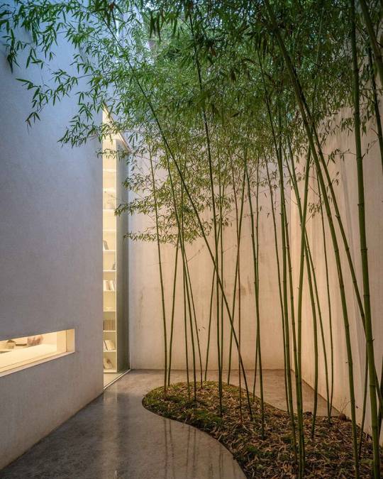
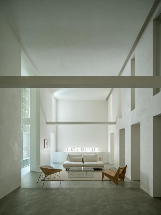
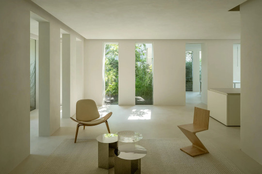


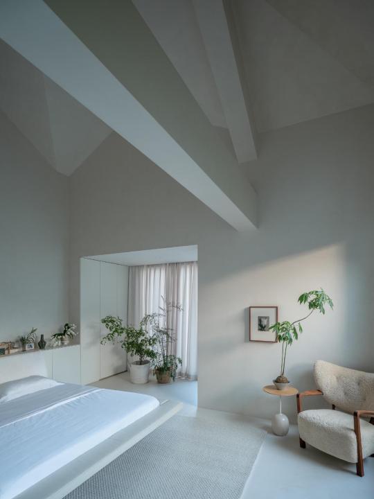
Forest Villa, Hefei China,
HAS Design And Research
#art#design#architecture#luxury house#luxury home#luxury lifestyle#gardens#forest#landscaping#china#white#hefei#has design and research
145 notes
·
View notes
Text
i feel like i could write an essay about why i’d never want to live in a house again. weird how i don’t feel safe in an essentially soundproofed building with the only people around, supposed friendly neighbors, wanting to keep to themselves because it’s difficult to deal with things like dv or “private family issues,” that stuff you’re on your own for
not to mention prices, gentrification and white washing, inaccessibility of the house itself or suburban mazes, quality of new construction, cost (and again, quality) of renovation, potential HOAs, legally required maintenance, zoning laws, lack of creative/innovative architecture, etc
so much of what suburbs are are upheld by pillars of white supremacy
#thoughts with no research#i could go on#multicultural psychology#sociology#architecture#child abuse#childhood trauma#home design#accessibility#design and disability
3 notes
·
View notes
Text


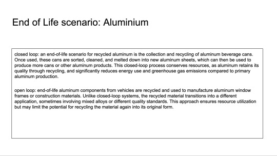


For the Material workshop Alaïa, Roos and I teamed up to prepare our selection of materials for our very own material passport. In the end we chose the following three materials to research:
Aluminium - Hydro CIRCAL Recycled Aluminium
Textile - Trevira CS
Polymer - colorfabb PHA
2 notes
·
View notes
Text


Some more Brisbane architecture
#architecture#inspiration#environment design#research#photography#mystuff#brisbane#queensland#australia
29 notes
·
View notes
Video
DSC_0333 Architectural Space (Collage) by Russell Moreton Via Flickr: russellmoreton.blogspot.com russellmoreton.tumblr.com
#collage#architectural#interior#photography#fragments#layers#ruins#material#place#site#reading#spatiality#working process#design#architecture#visual art#speculative#subjective#analysis#construction#making#Russell Moreton#visual fine art#spatial practice#research creation#ecology of experience#useless flickr uploader#flickr
2 notes
·
View notes
Link
After noticing that weather data from roughly circular cities like Dallas and London often show more rain than triangular cities like Chicago and Los Angeles, Dev Niyogi and his colleagues at the University of Texas at Austin decided to investigate the link between the shape of an urban area and its rainfall. The authors argue that how wind and weather interact with shape in urban environments should be taken into account when building future urban spaces that must be more resilient to the effects of climate change.
Circular cities, square cities, and triangular cities are rated in order of rainfall amount and intensity from largest to smallest. The findings are important for city development that is both sustainable and resilient, especially for those that are expanding.
This study provides the first investigation of the impact of city shape on urban rainfall in inland and coastal environments. Under calm synoptic conditions, the city shape impact is much more evident in coastal environments.
The team idealized large eddy simulations coupled with the Weather Research and Forecasting model. In the inland vs coastal environment, there are changes in the timing of urban-induced rainfall. This is linked to the land-sea breeze’s differing diurnal cycles of vertical velocity and cloud water mixing ratio. The effect of city shape on rainfall is especially visible at the coast, where buoyant flows from cities modify the interactions between urban-rural circulation and sea breeze.
Continue Reading
#geometry#geometrymatters#cognition#geometriccognition#cognitivegeometry#architecture#design#research#study#science#city#urbanism#rain#weather#statistics
39 notes
·
View notes
Text
These past earthquakes are a bit concerning, I've been feeling aftershocks all night. I felt them when I was in philly but then went home to family, who live on the fault-line in the highlands, and it's been consistent.
We have had earthquakes here before, the last epicenter I felt was a mile away from us in 2010-ish. But none of them have ever had aftershocks I could feel. I'm hoping the ramapo fault isn't becoming seismically active again because our building codes do not have earthquake protection
#fun fact the fault is named after the tribe i worked with#other fun fact i used to do a lot of code research for concept design on a lot of new skyscrapers#that was my architectural past#personal post related to nj
5 notes
·
View notes
Text
Cannot sleep :/
#just pav things#lying awake here with Inigo meta thoughts#specifically the nuances of why he never intervened when Archie and Dism were fighting#He is torn between these two ideas of reality— whether Archie is dead or alive. That is true.#But eventually the latter idea takes more of a foothold; which is just a recipe for mental disarray#It’s a break from the comfortable cycle of self-hatred and destruction. So this new thought has to be counteracted to maintain inertia#So as I understand it he’s now caught on those lingering feelings of abandonment that Archie has left him with. and he is Not Happy.#Because just as he interpreted himself as being a replacement for Dism#He’s interpreting Archie and his little motley crew as a further refusal to move on from the past#And because Inigo acts on impulse (as seen best with the 💥 arm getting blown off) he’s using that momentary anger#to distract himself from the core issue as he lashes out ✨#He’s kind of a hypocrite that one. Stresses the importance of embracing unpleasant memories as a fundamental part of your character#(To the point of berating Idyllia for going the total memory wipe route instead)#but he is ALSO an escapist at heart. Neither of them want their definition of pain so they both have terrible routines to try avoiding it ✌#I’m sorry if this made no sense Dolphin I will probably do a retake with more braincells in the next few days#You know I’ve been analysing the design of this kindergarten in sydney for VCD#It’s called Nubo. Now I’ve always had a fondness for Scandinavian aesthetics but this is PEAK#So I went down a research rabbit hole and I came out of it with a clear concept for what Amonea Montessori School should feel like!#It’s this sort of cross-concept between stereotypical Australian architecture and hygge#Those oak panels and muted colours and glass everywhere#And I can carry through to an overall unique visual identity for Amonea#After all Byrgir should feel similarly detached from Earth in it’s own subtle ways#Tapping more into solarpunk and that overall comforting feeling for Amonea in particular~#I’m so happy :D
3 notes
·
View notes
Photo

https://preliminaryresearchoffice.com/
#Preliminary Research Office#Architecture#architects#studio#portfolio#typography#type#typeface#font#AGBook Rounded#2023#Week 17#website#web design#inspire#inspiration#happywebdesign
7 notes
·
View notes
Text
The miraculous effect of music: Concerts bind people together
#music#concert#live music#science#research#art#physics#mind#consciousness#design#neuroscience#architecture
2 notes
·
View notes
Text

3 notes
·
View notes
Text
"The Elliot." My final comic for my comics class. Four more pages under the cut. Thank u for reading <3
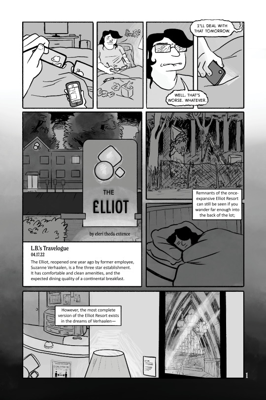
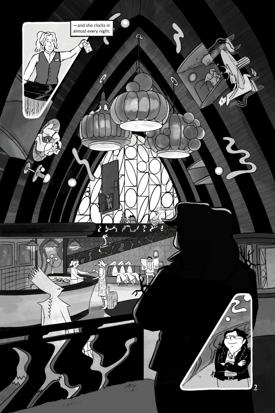


#comics#my art <3#I was going to write#“architecture and interior design nerds please do not come for me”#but please do actually if you have corrections or suggestions#the research was so hasty for this if I ever expand on this story I would want to do a lot more architecture/interior design research#the splash page of the lobby is based on the 1960s lobby of the Coco Palms Resort#and I think the plot line of it partially burning down is from that as well#I think the coco palms resort itself is not “googie” but I thought the architecture was swoopy enough to be googie-adjacent lol#hotel bennet#I don't really want to call this series hotel bennet anymore but im tagging it that for consistency#new tag will be L.B. Travelogue#If I ever use this tag again lol#or Bennet Travelogue? idk#motel#hotel#dreams#dreamscape
4 notes
·
View notes
Text
instagram
An #informationarchitecture of a #recycling #app that aims to #changetheworld. ♻️🌍 #uxflowcharts turned out to be handy and very useful in building the recycling #userexperience. If you don't skip this part of #userresearch, you can make the #userinterface and prototyping more efficient, and the product can meet the expectations and needs of all users. And recycling can become easier and more popular. #uxdesigner #recyclingapp #savetheplanet #hardworkpaysoff💪
#inspiration#ux#ux research#uxuidesign#uxuimaster#ux flowchart#information architecture#inspection#graphic design#Instagram
2 notes
·
View notes
